Ball Aerospace & Technologies Corp.
2/2015 - Present
Talent Development Specialist
12/2012 - 2/2015
Training Coordinator
4/2011 - 12/2012
Contractor
National Snow and Ice Data Center
3/2008 - 12/2010
Student Assistant
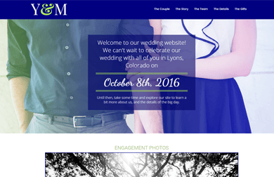
There were several requirements I had when creating the wedding website for my own wedding: it had to be very responsive since many people would be viewing it via mobile or tablet, it had to incorporate our wedding colors of cobalt blue and chartreuse green in a way that wasn't overwhelming to the user, and convey information quickly and efficiently.
The navigation is big, noticeable, and shows the user where they are on the page, allowing them to move around with a scrolling transition. Information was grouped as much as possible and included graphics to avoid long sections of text. The most crucial information (like the when, where, and how) is especially prominent in a 3-column grouping.
Less important information (which might still answer some guest's questions) was put into a Miscellaneous Info section organized by icons to allow users to quickly find what they need visually.
Cute personalized touches like the footer help keep the page relaxed, casual, and special.
This was also my first foray into Bootstrap (with which I fell in love instantly for its ease of responsive design).
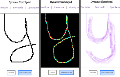
The concept for this project was simple: build an Etch-a-Sketch-like game using a script that will loop a certain number of times in order to generate a "grid" of square DIVs. The DIVs will then change color when the cursor is moved over them. Figuring out the correct way to create the rows of DIVs and how to set the height of the cells themselves was probably the most time-consuming part. However, once the DOM-manipulating part of the script was written, it was easy to modify it for different color modes.
In the future, I'd like to explore ways to make the grid larger (without slowing down the page to a grinding halt). I also think this kind of script could have some application to creating a puzzle game (for example revealing an image by toggling only certain DIVs on a grid.
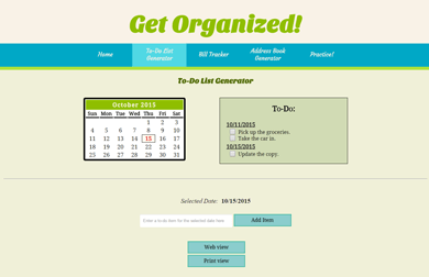
My final project for my JavaScript class needed to include as many concepts as possible that were covered during the semester. This site utilized calendars, dates, events, regular expressions, and arrays.
Using only JavaScript was challenging -- there were many times when it was frustrating to not be able to utilize jQuery features that I knew could accomplish what I needed in half the time that it took me to write the JavaScript (for example, the drag-and-drop on the "Practice!" page -- I wanted the item to "stick" to the cursor and move in real-time, which I was only able to accomplish with a 'click to pick up, click to put down' action via JS).
Future enhancements to this may include the ability to delete individual items from the To-Do List, as well as the ability to make items to future months (not only the current one).
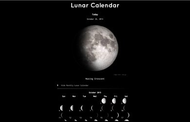
The original challenge presented in the text was to create a lunar calendar that summarized a variety of information about the phases of the moon; including the moon's age, the angle of ascension and declination, distance from Earth, and the current constellation it was in.
For this to be a useful experience for the everyday person, most of the information required seemed superfluous - not many people would know or care about the moon's age, angle, distance from Earth, or the constellation it was in.
To de-clutter the amount of information on the page and to be able to represent it most efficiently, I only left the current date, a graphic of the current phase, the name of the phase, and a monthly calendar.
Generating the graphics of the moon phases was probably the most time-consuming piece of the entire project. NASA had a graphic with 8 different phases available, and I used Photoshop to create 8 more for a total of 16 different phase pictures to ensure a smooth transition.
Future enhancements to this may include the ability to cycle between months, and set a custom date to see a larger graphic of what the moon phase will be on that date.
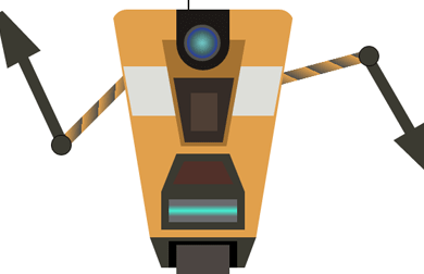
This was an interesting endeavor to test out the full capabilities of what CSS can do. The robot is drawn using only CSS and divs, employing features like shapes, transforms, and gradients.
As demonstrated by this, and other examples created by many artists and designers, CSS can eliminate the need for flat images — which means a more responsive and less-bulky pages.